Five moves from the portfolios of Yandex designers
6 August 2026 · 2 min read
Yandex is one of the larger sections in the gallery. I opened five portfolios back to back and found one decision in each worth taking. None of them is about looking good: all five are about how quickly the reader works out who they are dealing with.
The result, not the project name
On Artem Milovanov's site the case study subtitle is not a topic but an outcome: eight screens down to four, churn down 1.5 points.

The difference is enormous. "Onboarding redesign" tells you what someone worked on. "Eight screens down to four" tells you how it ended. The second can be checked, which is why it is believed.
Products first, yourself second
Alex Kovch opens not with a paragraph about himself but with a list of products, each line carrying its client's logo.
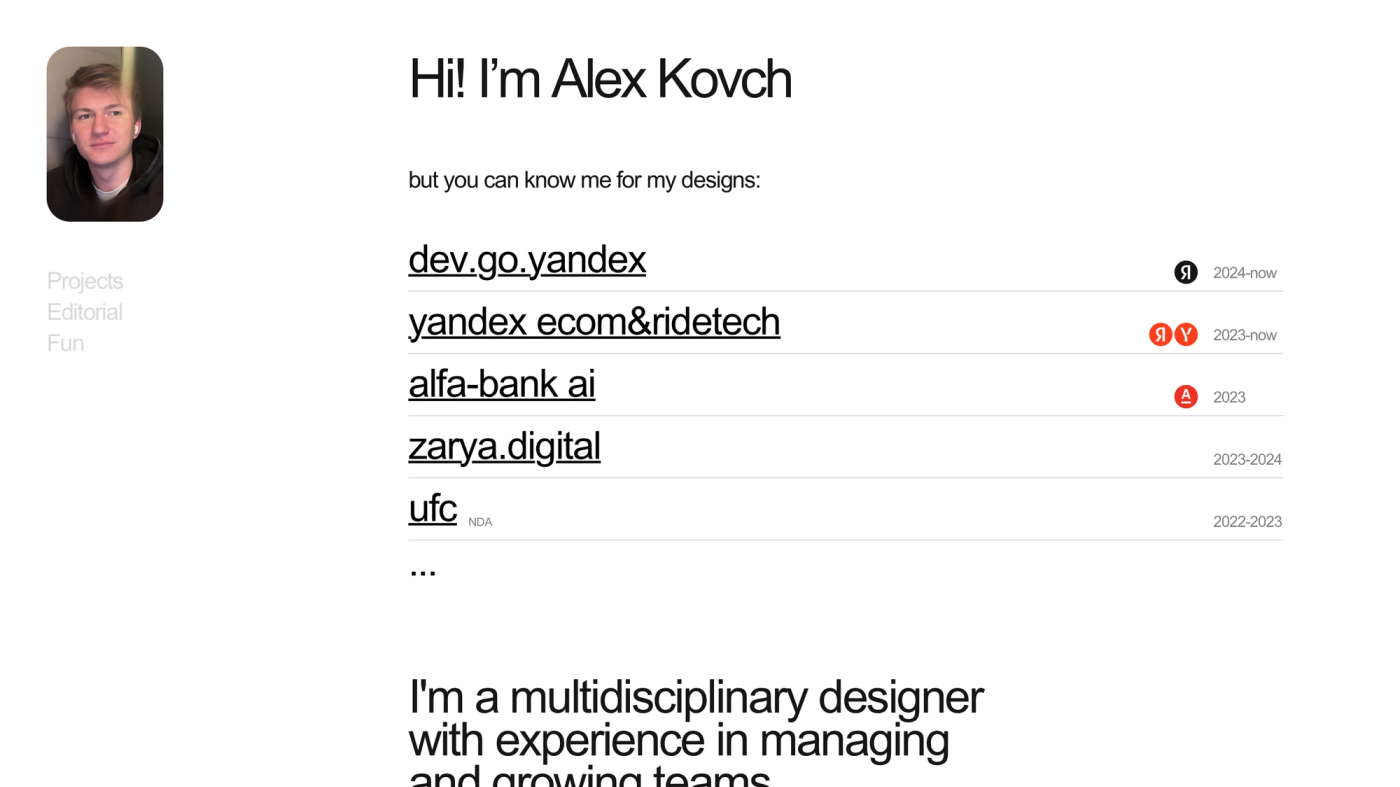
The reader recognises familiar marks before they get around to wondering who this is. Logos work as somebody else's signature under your work: they need no explaining and no taking on trust.
Interface fragments instead of case studies
Ilya Bahmutov shows pieces rather than whole projects. One tile is literally one component.
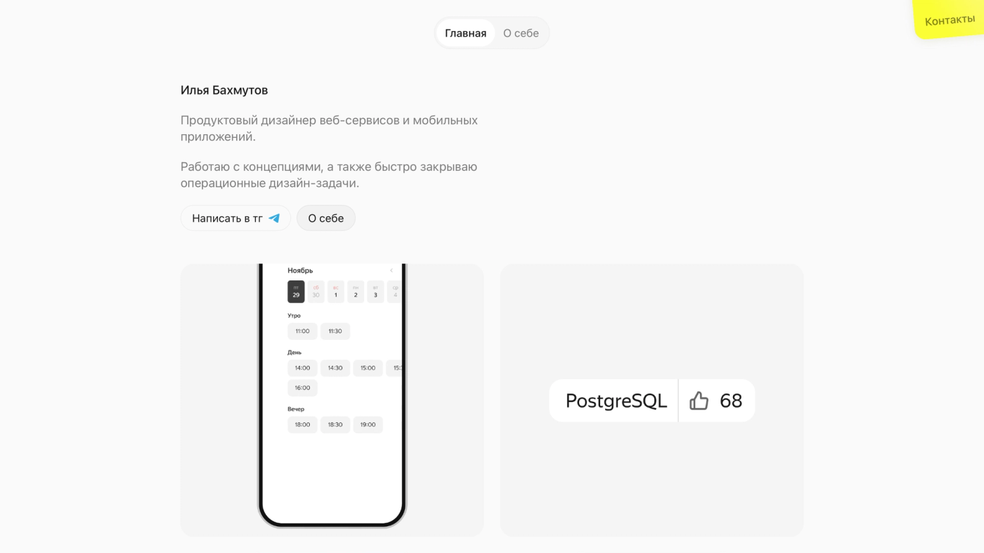
A bold call: a case study with a brief and research looks more substantial. But a case study has to be read, while a component lands in a second, and it answers the only question that matters — can this person draw an interface.
A name used as a logo
Ilya Izyanov sets his name in serif across the whole screen and pushes his career into small type in the corner.
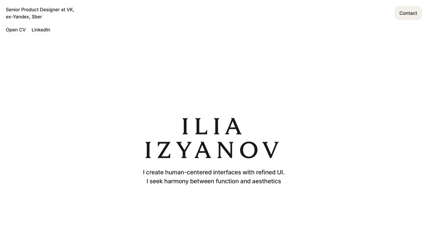
The usual arrangement is the opposite: small name, large credentials. Here the first screen works like a book cover rather than a CV, and the name is what stays with you.
One button, and not the one you expect
Tatiana Andronova puts a single button on the first screen, and it says contact me, not view my work.
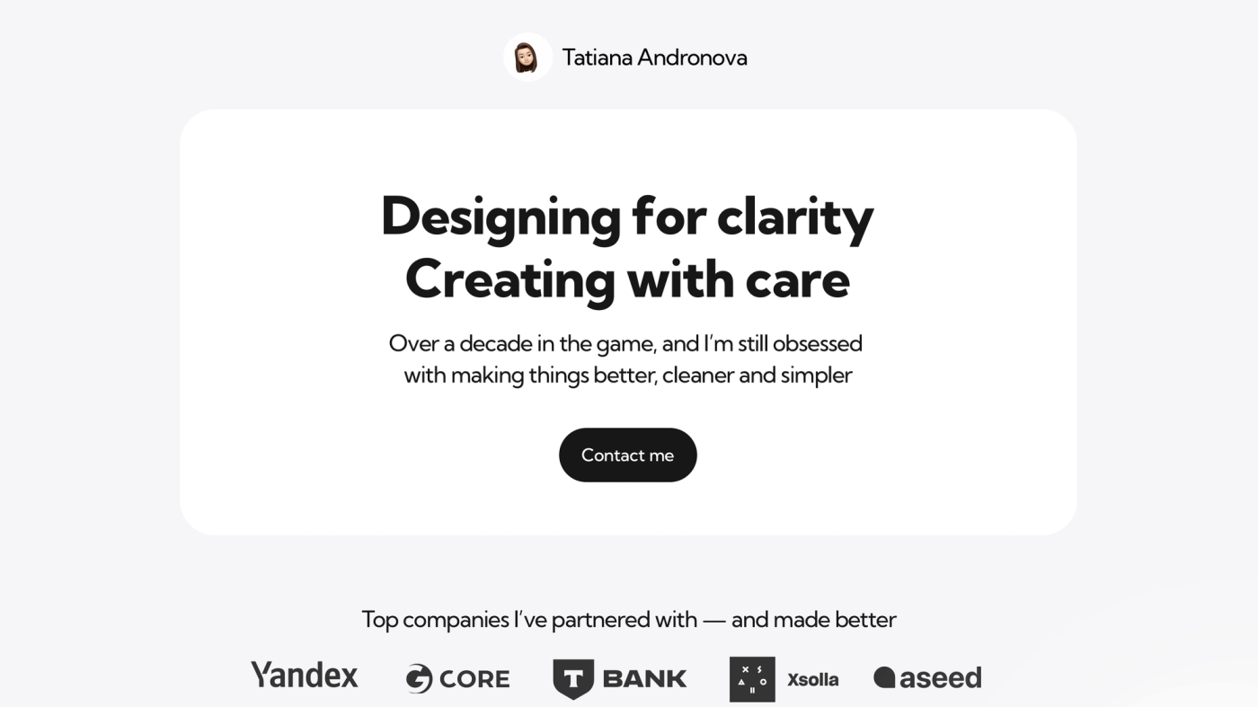
A portfolio exists for one action, and it is refreshing when that is remembered. "View my work" sends someone off to keep scrolling; "contact me" ends the journey where it was always heading.
What they share
All five save the reader time, each in its own way: a number instead of a description, someone else's logo instead of an explanation, a fragment instead of a case study, a name instead of a job title, an action instead of another page.
Portfolios get about a minute. The winner is not the one with the most work in it, but the one that is understood fastest.
The rest of the Yandex portfolios are in the gallery.